
Logo-folio
A collection of logos I have designed.
2023-2024
Over time I developed a number of logo concepts while working on different projects. Each one begins with a concept that reflects the purpose or environment of the initiative it represents.
While their contexts differ, my approach was always to create logos that feel distinct, easy to recognize and, at the same time, flexible enough to work across different applications, on both digital and printed materials.
AI Pitch Competition
Organization
Braventure, Erasmus Enterprise
Year
2024
The AI Pitch Competition is a regional competition that brings together startups working in artificial intelligence. The program gives founders a space to present their ideas and connect with others working on artificial intelligence.
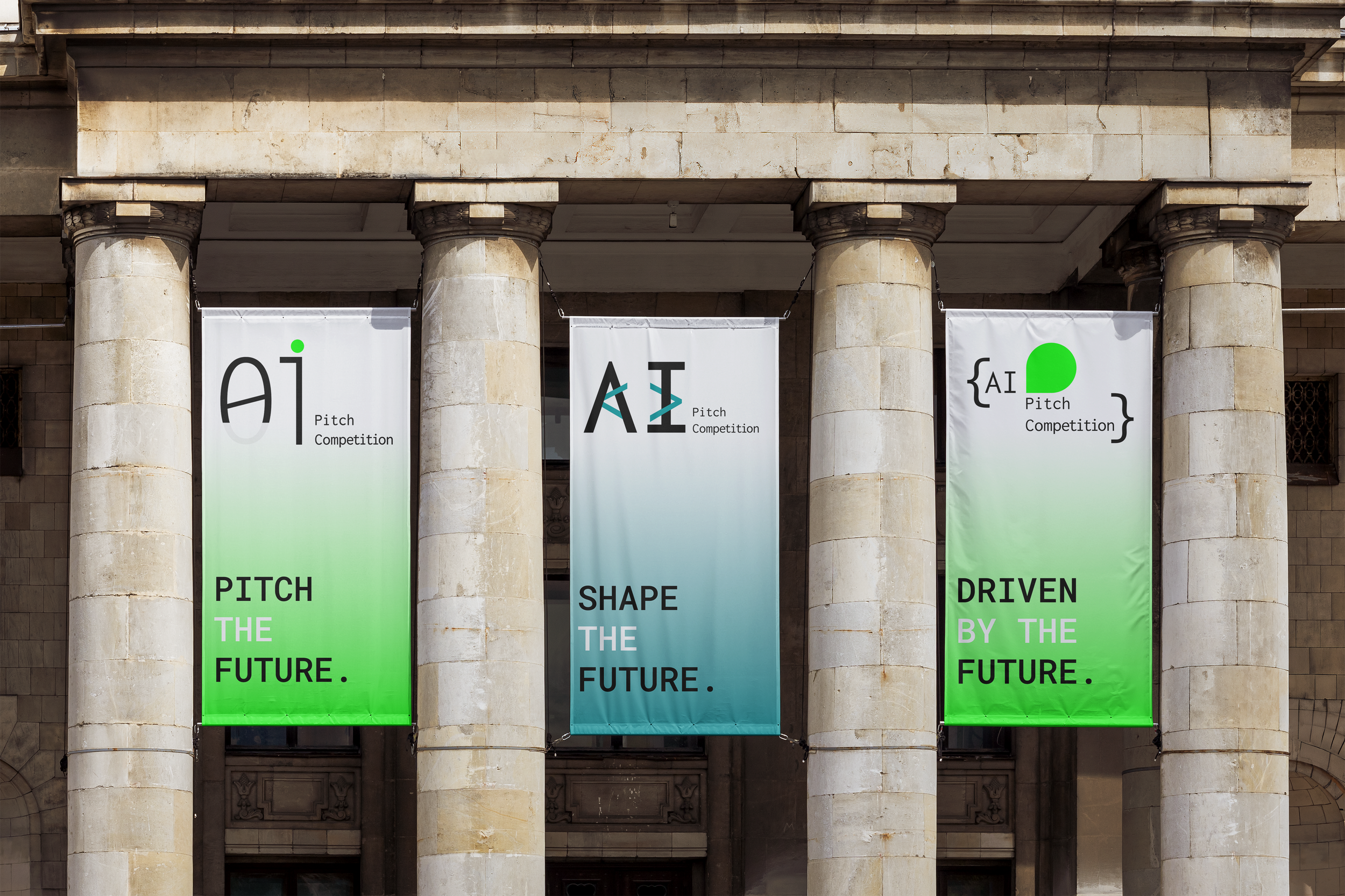
I developed three logo concepts, each focusing on a different aspect of AI. My aim was to design a logo that reflects both the technical side of artificial intelligence and the startup environment surrounding the program.
-

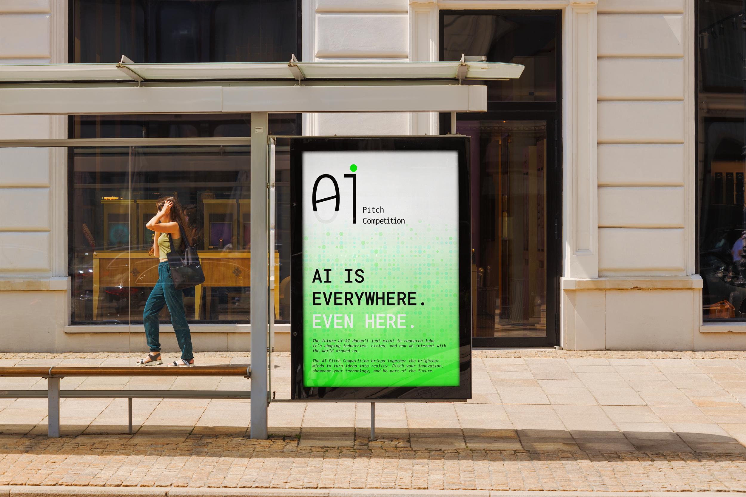
I
The logo is inspired from the binary system (01), reflecting the fundamental coding and building behind artificial intelligence. The number 01 is cut to form the letters AI, connecting it directly to the technological nature of the competition.
-

II
The logo is inspired from {the brackets} commonly used in coding. The central shape refers both to pitching and to a chat bubble, hinting at interaction with AI models while reinforcing the tech focus of the competition.
-

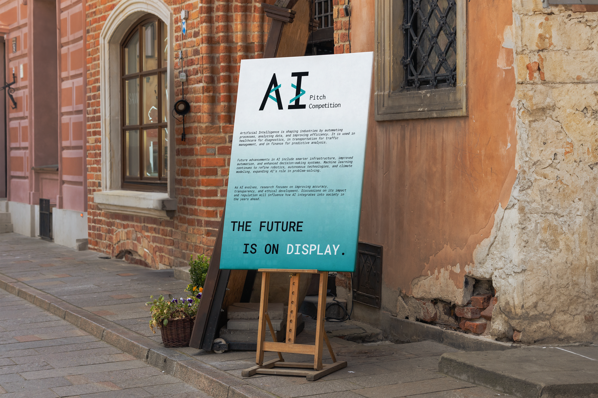
III
The chosen logo integrates the angle brackets, referencing the development side of AI while also pointing to innovation and technology.
NL Startup Competition
Organization
Erasmus Enterprise, Upstream
Year
2024
NL Startup Competition is an initiative that aims to bring together startups across certain categories to showcase their ideas, pitch to a live audience, and connect with key players in the entrepreneurial ecosystem.
For this program, my goal was to create a logo that reflects both the competitive nature of the program and the environment of the startup ecosystem. While keeping the focus on entrepreneurship, I used orange as a subtle reference to the competition taking place in the Netherlands.
-

I
The logo uses two shapes derived from the letter N, alongside geometric forms inspired by the L in NL. Their uneven placement suggests individuality and competition, while the upward direction hints at the idea of rising and winning.
-
II
A variation of the final logo, this version applies gradient colors inspired by the competition’s organizational partner brands. The fluid transition between colors reflects collaboration, innovation and the dynamic nature of startups.
-

III
The logo uses half-circle and quarter-circle elements that subtly form the letters N and L. The changing geometry reflects growth and movement, echoing how startups evolve, scale and connect within the entrepreneurial ecosystem.


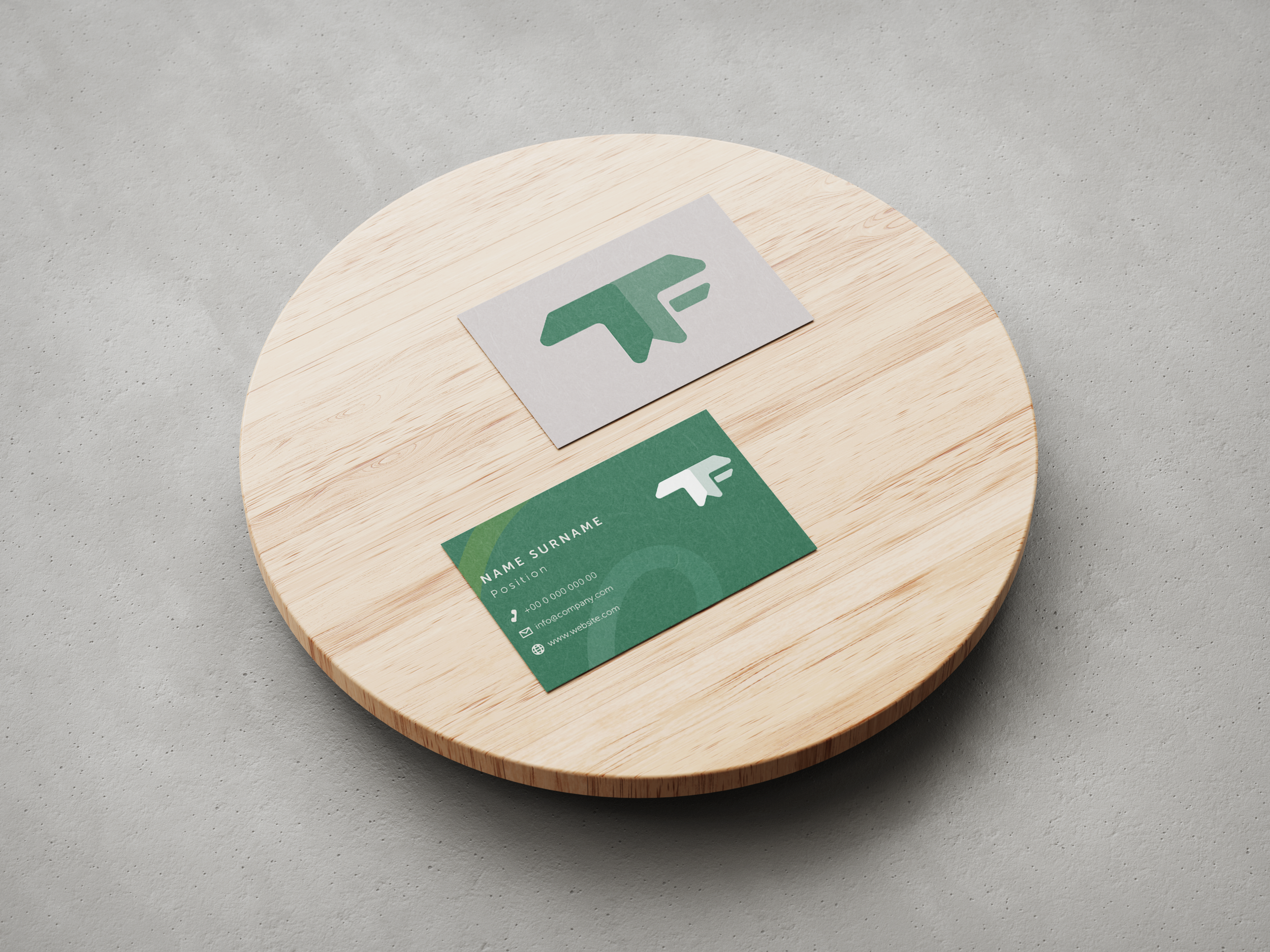
Talent for Transition
Organization
Erasmus Enterprise
Year
2023
Talent for Transition is a program that focuses on driving sustainable innovation. Through workshops and various activities, the program helps participants to see how they can contribute to long-term social and environmental transitions.
For this program I developed three logo concepts, each focusing on a different aspect of the initiative. My aim was to create a logo that reflects the program’s focus on change, progress and long-term impact.
-

I - Social
The logo contains two curved shapes derived from the letter “T” in Talent for Transition (TFT). Their form recalls two people facing each other, symbolizing the social aspect of the program and the connections formed during its activities. The gradual transition between the shapes (F from TFT) hints at movement and change, reflecting the idea of transition.
-

II - Connection
This concept uses two shapes derived from the T in TFT, resembling conversation bubbles. The forms represent networking and exchange, reflecting the discussions and connections that take place throughout the Talent for Transition program.
-

III - Progress
This chosen logo concept is built from arrow shapes that suggest movement and forward direction. Two arrows form the letter T, while a horizontal element forms the F. The green color emphasizes the program’s focus on sustainability and forward-looking innovation.


Have a project in mind?
I'm always open to new collaborations and interesting projects, or just want to chat about design! Whether you have a clear brief or just a rough idea, I'd love to hear from you.